Microsoft PowerPoint offers various options for creating professional presentations: Text, charts & tables, images & graphics, animations & videos. Nevertheless, it is not easy to create appealing slides. It is worth the effort, though, as endless presentations with overloaded slides and without a clear structure quickly become boring. To help you impress your audience with your next presentation, we have summarized the most important basic rules for you.

PowerPoint Dos & Don’ts – avoidable mistakes
Colour accents instead of colourful chaos
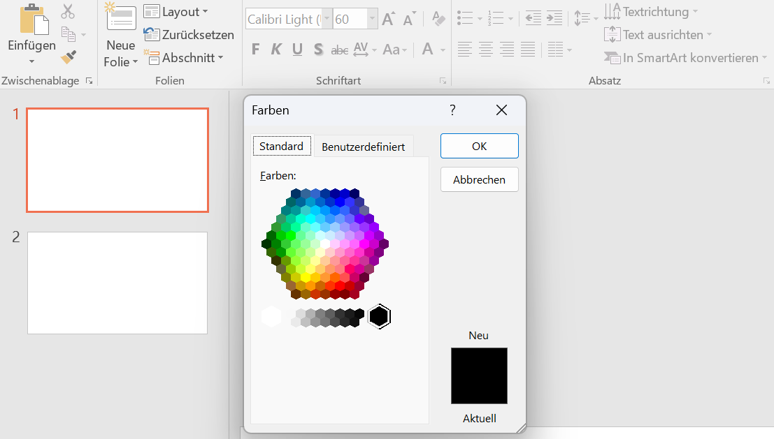
If you use different font colours, a coloured background and colourful graphics, you will create more confusion than relief. The audience won’t know where to look first. What’s more, colourful presentations often look frivolous and like an homage to the 1990s. It is better to keep it stylishly restrained: use a dark font on a white background to achieve the best contrast. Use sparing colour accents to highlight important points.
Less is more
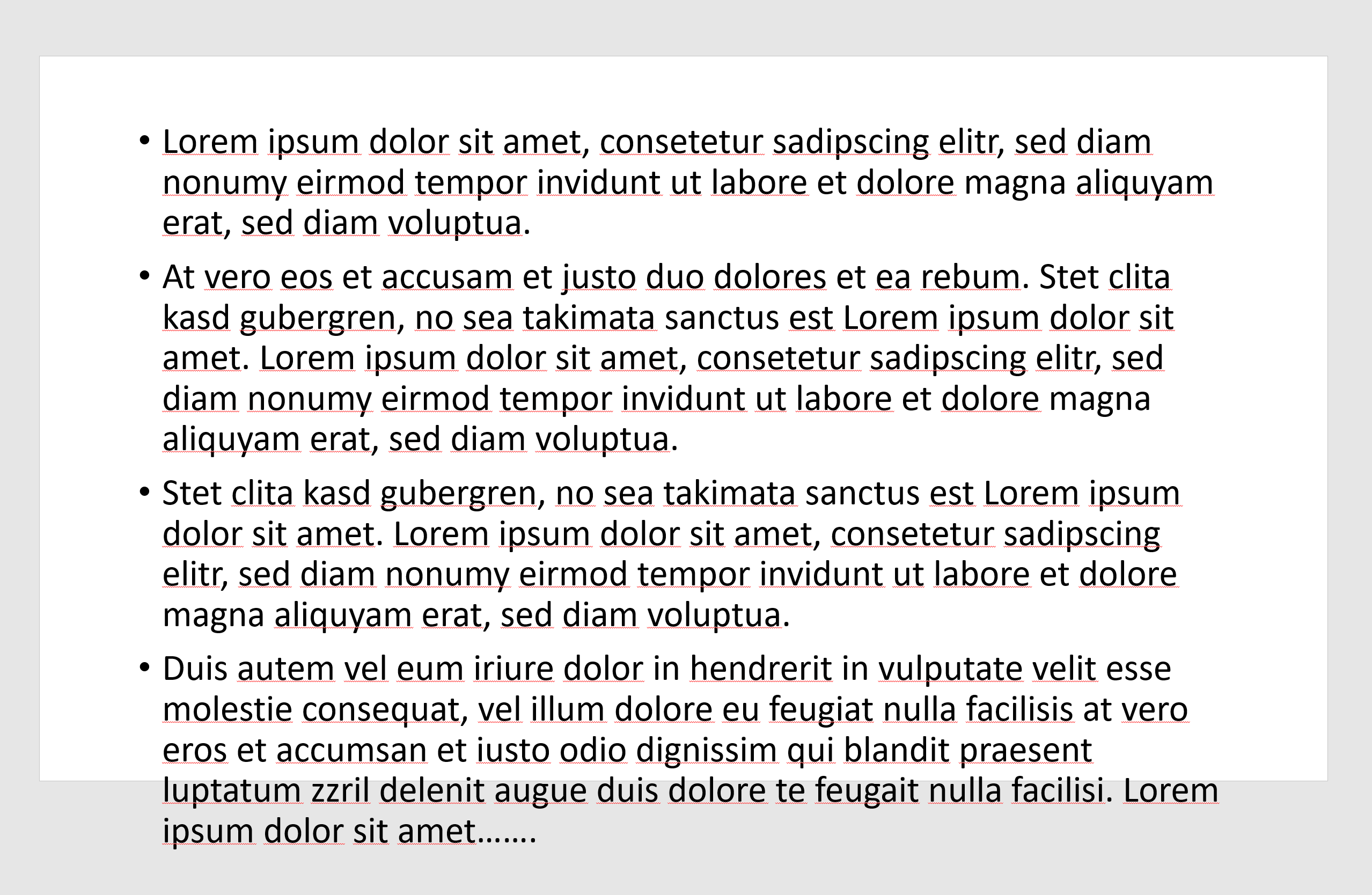
Slides often resemble a desert of text. People often lack the courage to concentrate only on the essentials. Or there is a lack of time or the necessary knowledge to summarize facts clearly and briefly. Too much text leads to the audience reading along instead of listening. And even as a speaker, you quickly become a lecturer. To avoid this, you should limit yourself to short and concise information that you can explain on the “audio track”. Less text on the slides means more attention for your message.
Playing the animation director
When blocks of text fly in from all sides or graphics tumble in, it looks neither serious nor modern. Above all, such effects cannot distract from the weak content of a presentation. You should thus put your energy into creating convincing content rather than adding visual effects. However, when used sensibly, animations can certainly be helpful – for example, if you want to work through the content of the presentation step by step together with your audience.
The most important keyboard shortcuts for Microsoft PowerPoint
As with other Office programs, you can save valuable time when designing your slides in Microsoft PowerPoint with the right shortcuts. You can find some of the most useful shortcuts in our overview:
PowerPoint Dos & Don'ts – how to do it right
KISS – Keep it straight and simple
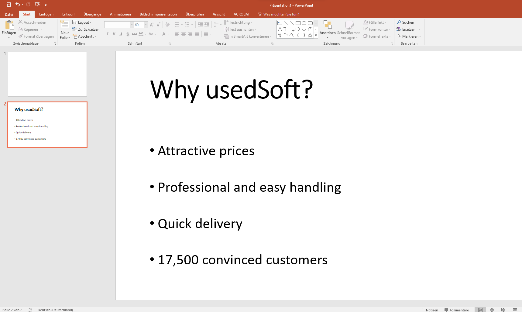
The KISS principle is the simplest, but also the most efficient rule for preparing convincing presentations. Convey one clear message per slide and formulate it in short, easy-to-understand bullet points. This will prevent a flood of text from blurring your core message. At the same time, you ensure that the audience follows your oral explanations and additions attentively.
Present complex information visually
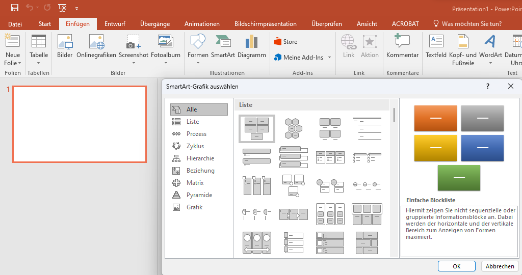
Business presentations often need to present figures, processes, project phases or hierarchies. It is usually difficult to convey such content in text or table form. The slides then quickly become overloaded and confusing. Visualisations can help to make complex relationships clear. There are some helpful templates in PowerPoint under Insert > SmartArt.
The layout follows the content
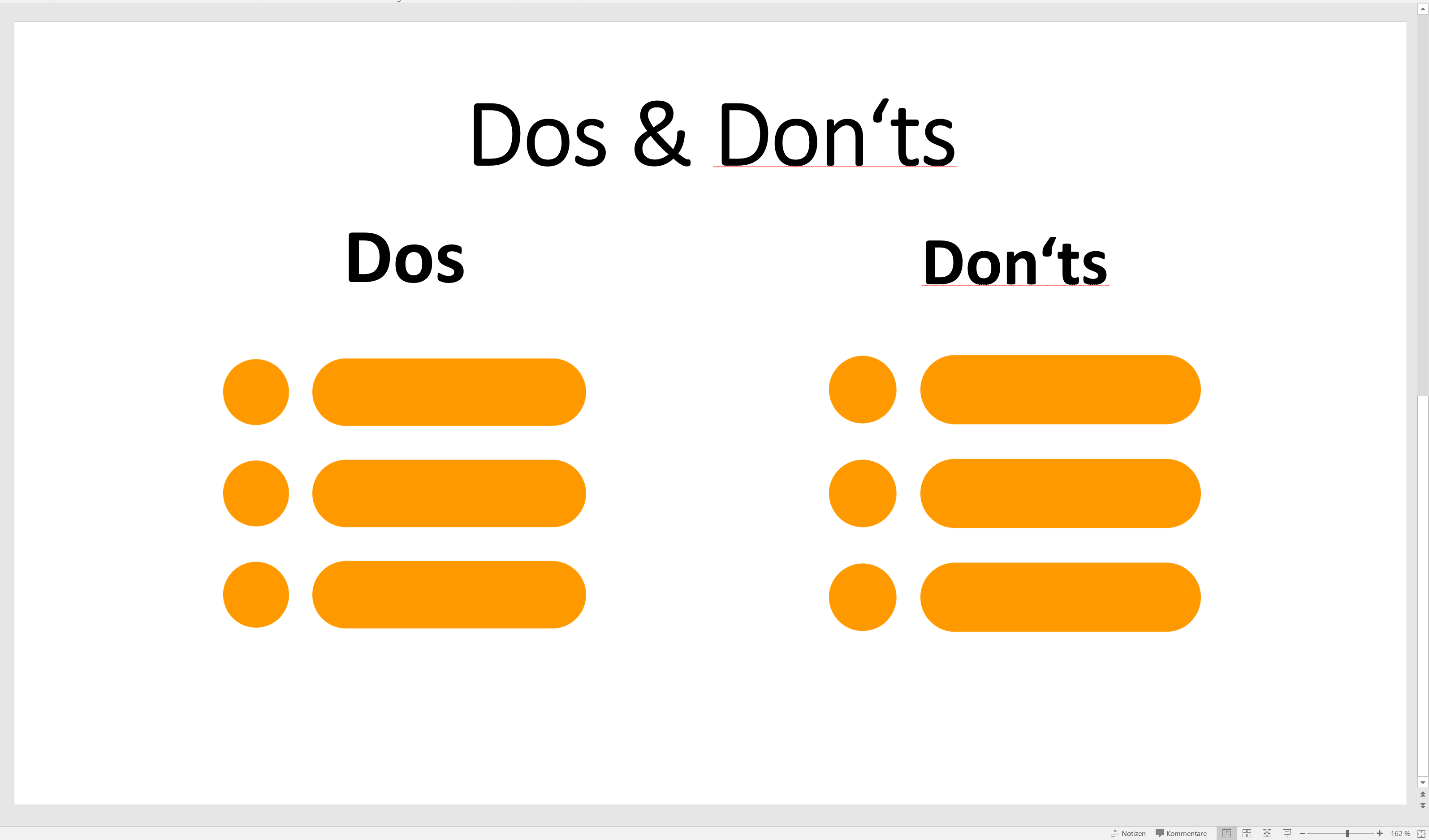
Are you comparing two facts in your presentation or discussing the pros and cons of a solution with your audience? The design of the slide should reflect this. Use a carefully selected design and layout to emphasize your arguments and give your slides a clear, easy to follow structure.

Refurbished hardware is all the rage

Virtualisation in comparison
